
You’d be forgiven for thinking typography is just about “picking a nice font.” Kind of like thinking a cocktail is just “some juice and vodka”—technically true, but oh, so wrong.
Typography is the unsung hero of branding—the voice tone, body language, and facial expression of your written message. It’s the design equivalent of choosing between a polite handshake and a jazz hands entrance.
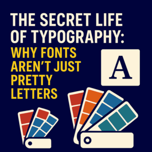
Here’s the insider scoop on why type matters, and how to wield it with style and confidence.
1. Fonts Have Feelings Too
Not all typefaces are created equal. A serif font (like Garamond) says “trust me, I have a law degree,” while a thick slab sans (think Anton or Bebas Neue) might shout “I eat kettlebells for breakfast.”
If your logo uses Comic Sans, what you’re really saying is: “I was held at gunpoint by Microsoft Word in 2003.”
Typography helps communicate personality before anyone reads a word. Want to sound chic? Maybe go Bodoni. Want to feel fresh and friendly? Try Poppins or Nunito. Want to look like a cult from the future? There’s always Eurostile Bold Extended.
2. Spacing Is Not Optional
Ah, kerning. The gentle art of ensuring your text doesn’t accidentally say “Cli ckers” instead of “Clickers.” Spacing between letters (kerning), lines (leading), and words (tracking) can make or break legibility.
Good spacing makes your design feel intentional. Bad spacing makes your logo look like it was created during a power cut.
3. Pair Wisely, Like Wine and Cheese
Font pairing is a dance—ideally a graceful one, not a pub brawl.
Stick with contrast, not conflict. Think of a bold headline font with a subtle, legible body font. If they look too similar, it’s like showing up to a party in matching outfits. Cute, but confusing.
My go-to rule? One “flavour” font, one “function” font. And never more than three unless you’re designing ransom notes.
4. Alignment: Your Secret Weapon
Good alignment isn’t just neat—it subconsciously builds trust. Whether it’s centred elegance or left-aligned precision, your choice of alignment gives structure and tone.
And yes, full justification has a time and place… usually in 1987.
5. Keep It Readable, Darling
The fanciest font in the world means nothing if nobody can read it. Save the flourishes for your invitation to Hogwarts—your website, pitch deck, or brief should communicate fast and clearly.
The golden rule: form follows function. If your text looks like a Renaissance tapestry, it might not be ideal for a pricing table.
In Summary:
Typography is design’s secret voice. It influences mood, meaning, and trust more than most people realise. So the next time you’re picking a font, don’t just scroll until you find one that looks “nice.” Pick one that speaks the way your brand speaks.
And if in doubt? Keep it clean, give it space, and for the love of Helvetica—never stretch your text.