Do you find yourself facing a difficulty with the quality of your company logo when resized? – for example, the printing company has made it bigger so that you can display it on A1 – only to find that it looks all pixelated when you get the proof sent to you – or worse still you have already paid for it?
The chances are you have sent over a Raster image and not the original vector art – If you have the original artwork in vector then it is happy days but if you haven’t then what do you do?
1. You can either find an App that will convert them for you like Vectorizer – Free Image Vectorization
2. Or manually trace your original image in Adobe Illustrator (free alternatives are available but we don’t use any other than Adobe illustrator)
3. You ask us to do it for you – you can see our price guide here

Lorem ipsum dolor sit amet, consectetur adipiscing elit. Ut elit tellus, luctus nec ullamcorper mattis, pulvinar dapibus leo.
Lorem ipsum dolor sit amet, consectetur adipiscing elit. Ut elit tellus, luctus nec ullamcorper mattis, pulvinar dapibus leo.
Do you find yourself facing a difficulty with the quality of your company logo when resized? – for example, the printing company has made it bigger so that you can display it on A1 – only to find that it looks all pixelated when you get the proof sent to you – or worse still you have already paid for it?
The chances are you have sent over a Raster image and not the original vector art – If you have the original artwork in vector then it is happy days but if you haven’t then what do you do?
You can either find an App that will convert them for

Don’t be fooled by the title. Not all logos are simple to create and can be as complicated as you like. As a general rule though the less busy you make them the more they can stand out. Take Nike for example, a simple tick but we all know who it belongs to – Microsoft’s windows logo contains vibrant colours and is simple in its design – This is the power of simplicity and can be powerful when branding your company. It’s important to keep colours consistent
When customers seek a logo design, the colors used are just as significant as the design itself.
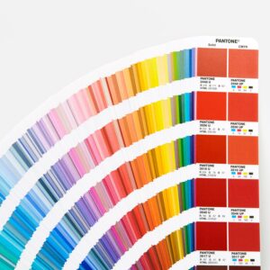
They are essential for establishing brand identity, emotional connection, and visual recognition. However, an often-overlooked aspect of color selection in logo design is the difference between Pantone colors and CMYK. While both color systems have their purposes in printing and digital design, Pantone colors are particularly crucial for logo design due to their consistency, accuracy, and versatility. This essay explores why Pantone colors are superior to CMYK for logo design and how this choice affects the final product’s appearance across various media.

Lorem ipsum dolor sit amet, consectetur adipiscing elit. Ut elit tellus, luctus nec ullamcorper mattis, pulvinar dapibus leo.