
We’ve all seen them: the logos that instantly scream trust me, I’m professional—and the ones that whisper I was designed in Microsoft Word at 2 a.m. And while it’s true that beauty is in the eye of the beholder, branding experts would argue that a great logo isn’t just pretty—it’s practical, purposeful, and a little bit magic.
So what separates a logo that turns heads from one that turns stomachs? Let’s break it down:
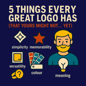
1. Simplicity That Slaps
The best logos aren’t cluttered with detail or trying to tell your entire life story. They’re like the best elevator pitches—quick, clear, and confident. Think Nike, Apple, or the golden arches (which somehow make you hungry just by existing). A great logo distils your essence into a glance.
Client translation: If you need three paragraphs to explain your logo, it might be too complicated. Keep it clean, clever, and iconic.
2. Memorability (The Good Kind)
Your logo should stick in people’s minds, like that catchy song you hate to love. If it fades faster than a cheap tattoo on a beach holiday, it’s not doing its job. Shape, colour, and a distinctive twist (like a hidden arrow in FedEx or a smile in Amazon) make your logo easy to recall—and even easier to trust.
Bonus tip: If someone can doodle it from memory on a napkin, you’re golden.
3. Versatility on Every Platform
A great logo works on a billboard and a business card. It should look just as sharp stitched on a t-shirt as it does on your website’s favicon. That’s why scalability matters—and why vector graphics are your best friend (sorry, pixel-based JPGs, it’s not you, it’s math).
The test? Shrink it down to 16×16 pixels. Still recognisable? Good. Vanished into oblivion? Back to the drawing board.
4. The Right Colour and Typeface Combo
Fonts have feelings. Colours have personalities. Choose unwisely and your brand says “used car dealership” when you were going for “boutique consultancy.” Great logo designers don’t just pick colours—they choose hues that evoke trust, passion, professionalism, or fun, all depending on your business DNA.
Pro tip: Ask your designer why they chose a font. If they say “It looked cool,” politely hand them a typography textbook and walk away.
5. Meaning and Relevance
A great logo isn’t just attractive—it’s relevant. It embodies who you are, what you offer, and how you want to be remembered. It’s a visual handshake. Whether it’s a subtle nod to your heritage or a clever metaphor (like a smile hiding in an arrow), the best logos mean something.
Translation: Pretty is great. Pretty with purpose is unforgettable.
So, there you have it. The five magic ingredients of logo greatness. And if your current logo is missing a couple—or all five—we should probably talk.